I just needed a LinkedIn cover
How a designer and an AI built a cover generator in a week, and why the designer still mattered.
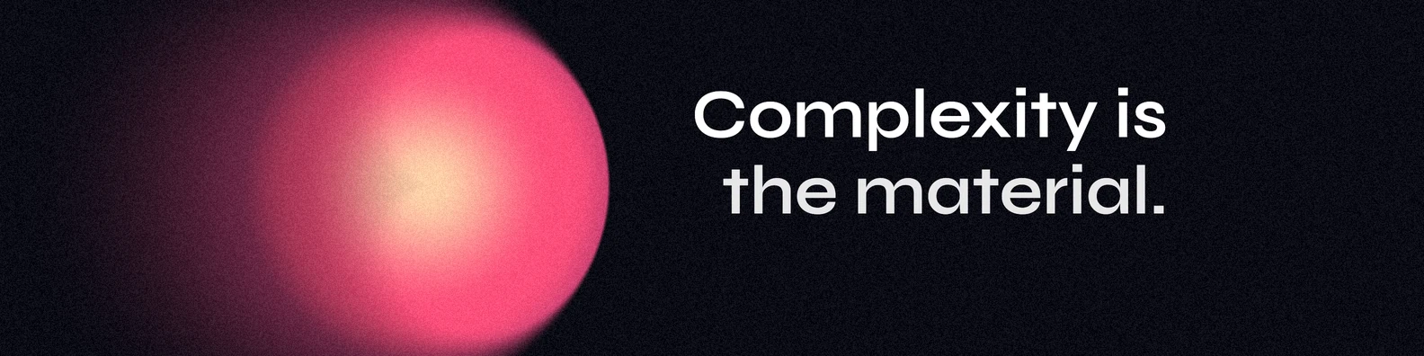
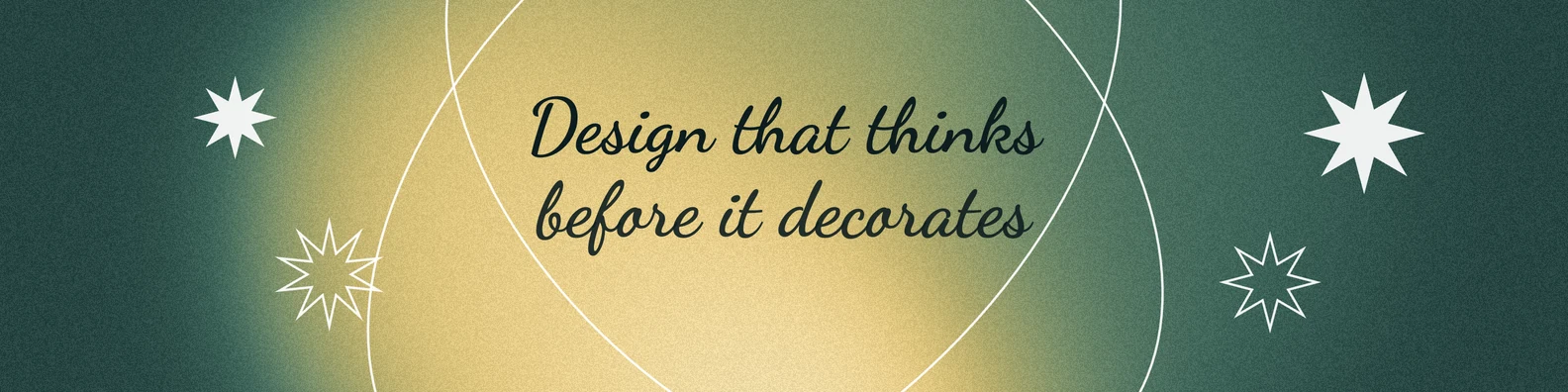
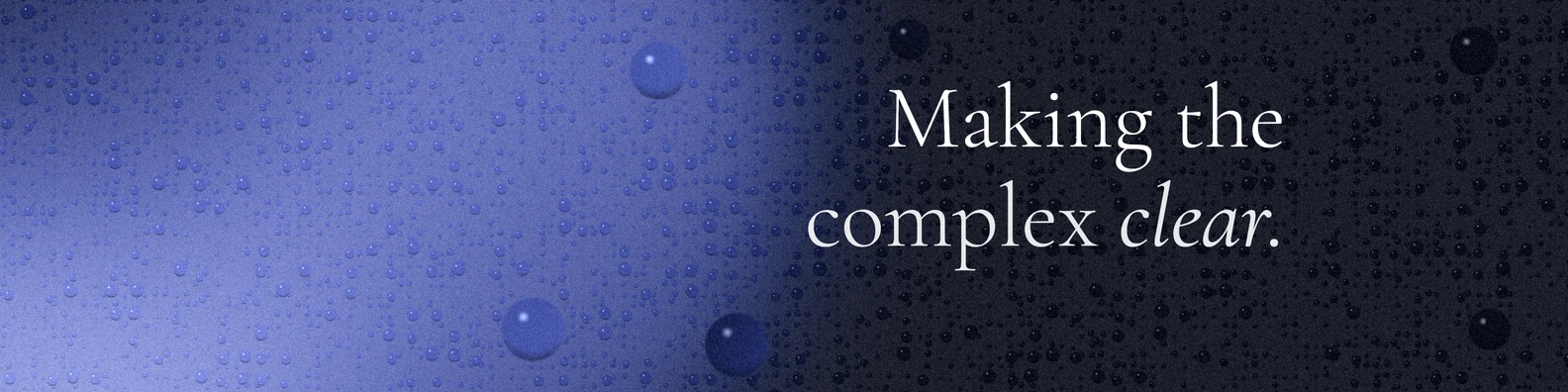
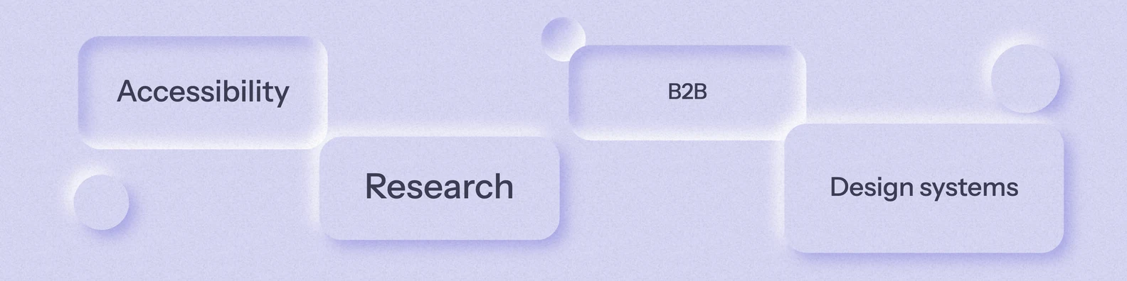
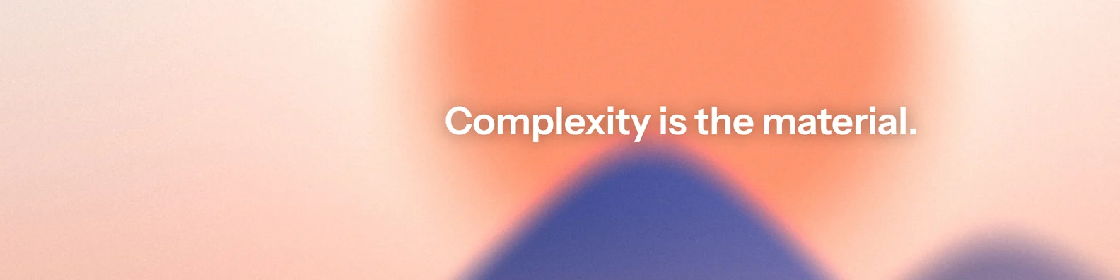
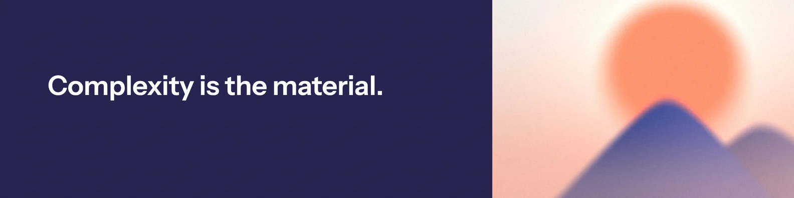
Four covers from the generator. Make your own.
How a designer and an AI built a cover generator in a week, and why the designer still mattered.
Four covers from the generator. Make your own.
Recruiters keep saying that a LinkedIn cover should sell you too.
So you search for something that almost fits, or you open Figma and design one. For me it was always a pain point: a small one, but it kept coming back.
On the morning of 14 October I wrote to Claude, the AI assistant I work with: “I have this...crazy idea.” I had seen a gradient generator I liked. What if there was one for LinkedIn covers, “with more settings, of course”?
I called it an MVP “just for me”. I wanted my life to be easier, I wanted something to play with, and I wanted to find out how a specialist and an AI really work together, and how fast.
A generator that really runs is not a mock-up. Before, an idea like this would have waited for a developer. This time nothing waited. I could say what I wanted and be using it the same evening. That is the part that still feels like an adventure.
Every test could be green and the tool could still be wrong. These are real moments from that week, in the words I used at the time. The “before” pictures are the old versions, opened again from the project's history.
It's not okay for a text or a tag to blink like that, it hurts eyes.
The tags blinked, which a still picture can't show. They were also only plain words. Now they hold steady, and on a Neumorphism cover they can take the style's own raised look.

Everywhere in the website content is aligned with the header and consistency must remain.
The page worked and looked fine by itself. But its content ran wider than the header, unlike every other page on this site. No test had a reason to notice that.
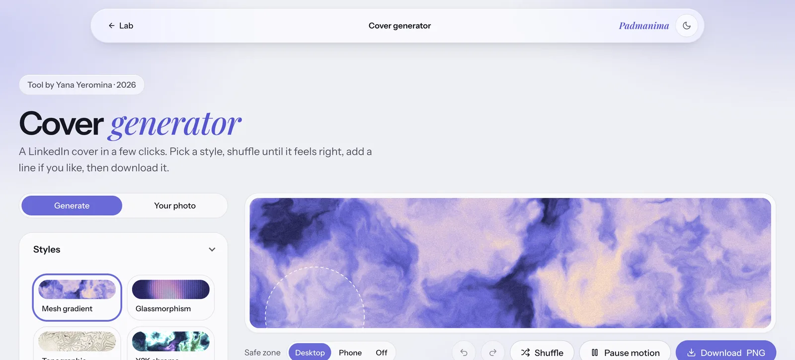
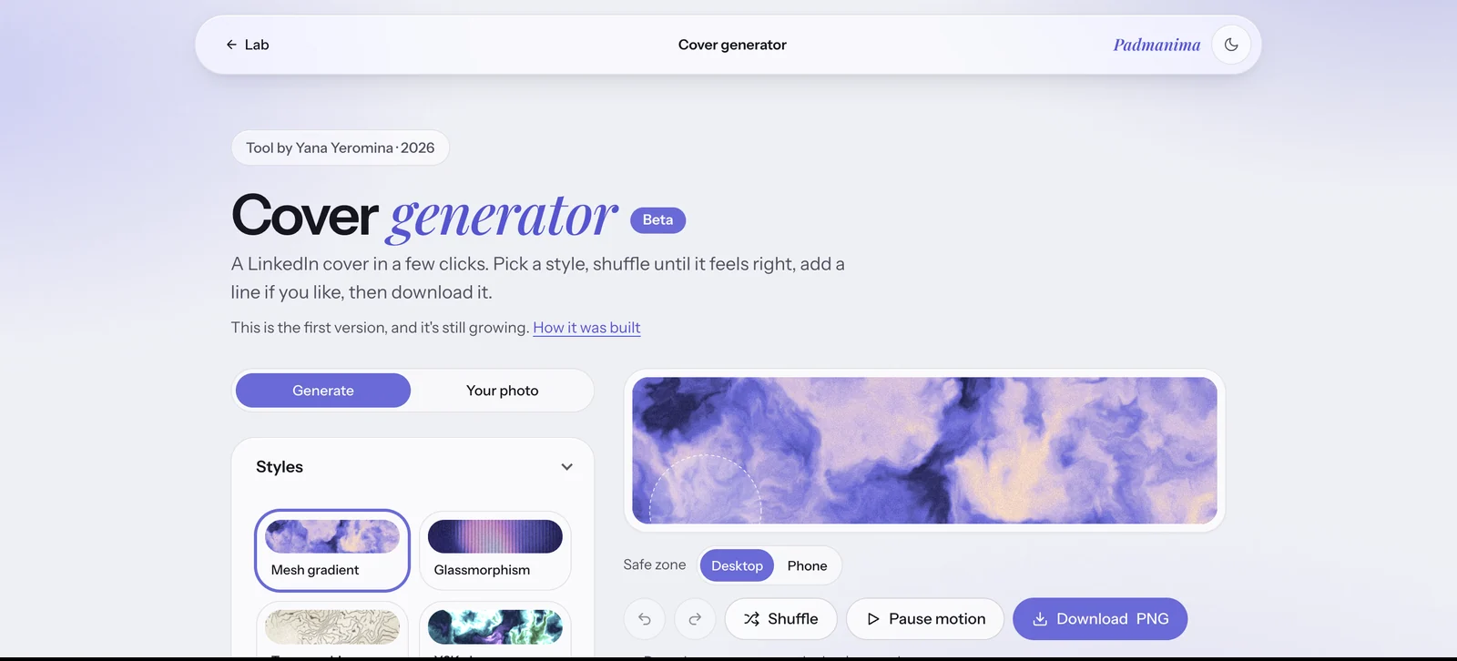
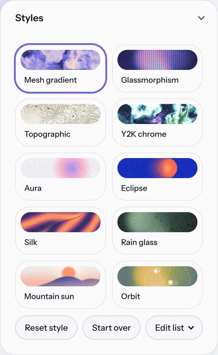
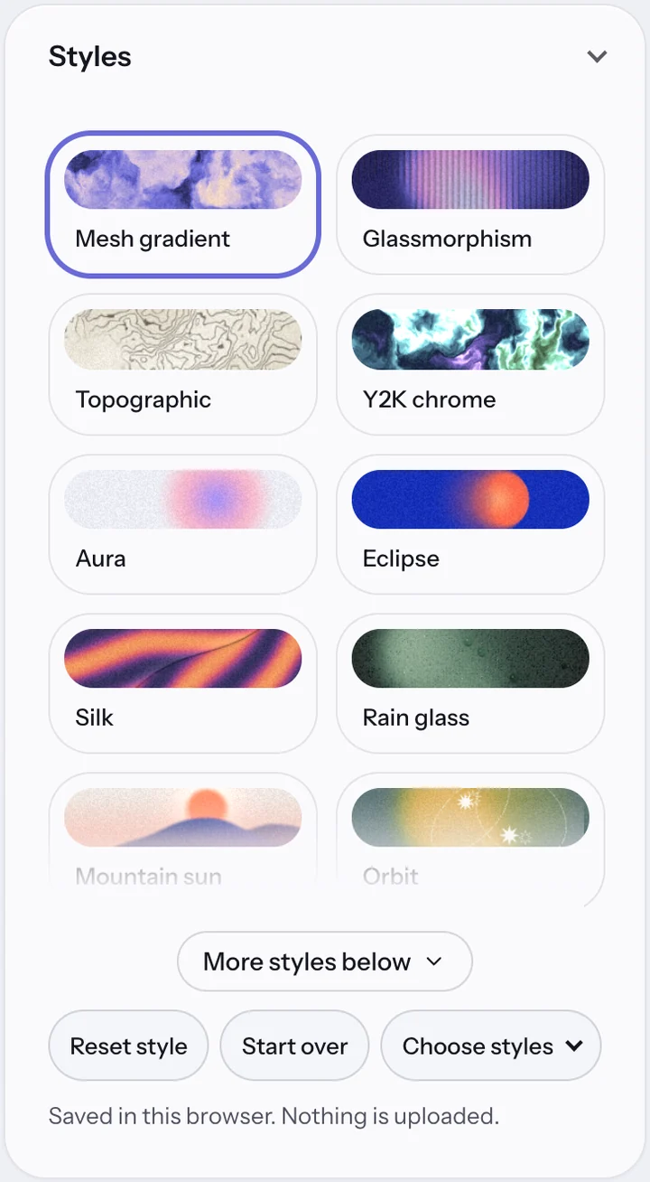
I know that the panel is scrollable, but a user who doesn't, wont see the scroll and won't know it is there at all.
I knew there were more styles because I had asked for them. A visitor wouldn't. A small button now says there's more below.
Two mountain sliders with different names did one job. It took using them to feel it.
A name should come from what people see on the screen.
That's how long I hunted for the gloss settings. They moved to sit right under the look they belong to.
At one point I wrote: “I feel like I am adjusting your work wrongly and intervening.” I'm keeping that here because I think other designers will recognise the feeling. It was the wrong way round: those corrections were the work.
Three kinds of checks, each seeing something the others can't.
Automated tests run inside the page and answer one question: does it still do what we agreed? There were 156 after the first night, 261 at launch and 284 now.
Accessibility scans check the page against WCAG 2.2 AA, in light and in dark. It ended with zero violations.
UX audits use a skill I built with Claude, which checks a product against Nielsen Norman Group guidance and WCAG. I ran the first one in a separate conversation that hadn't seen any of the building.
| First audit | Second audit | |
|---|---|---|
| When | The first night | 20 October, on the finished first version |
| The brief | Test how it works, how it looks and how easy it is | Be an average person who came to make a cover |
| Findings | 13, of which 2 major | 13, of which 1 major |
| Worst one | New visitors could see only 8 of the 21 styles | The motto was hard to read in 8 of 21 styles, with no warning |
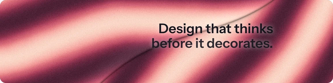
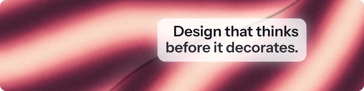
Your motto can come out unreadable in 8 of 21 styles, with no warning.
The automatic text colour was chosen from an average, and busy backgrounds broke it. On Y2K chrome, 39% of the area behind the text was too low in contrast.
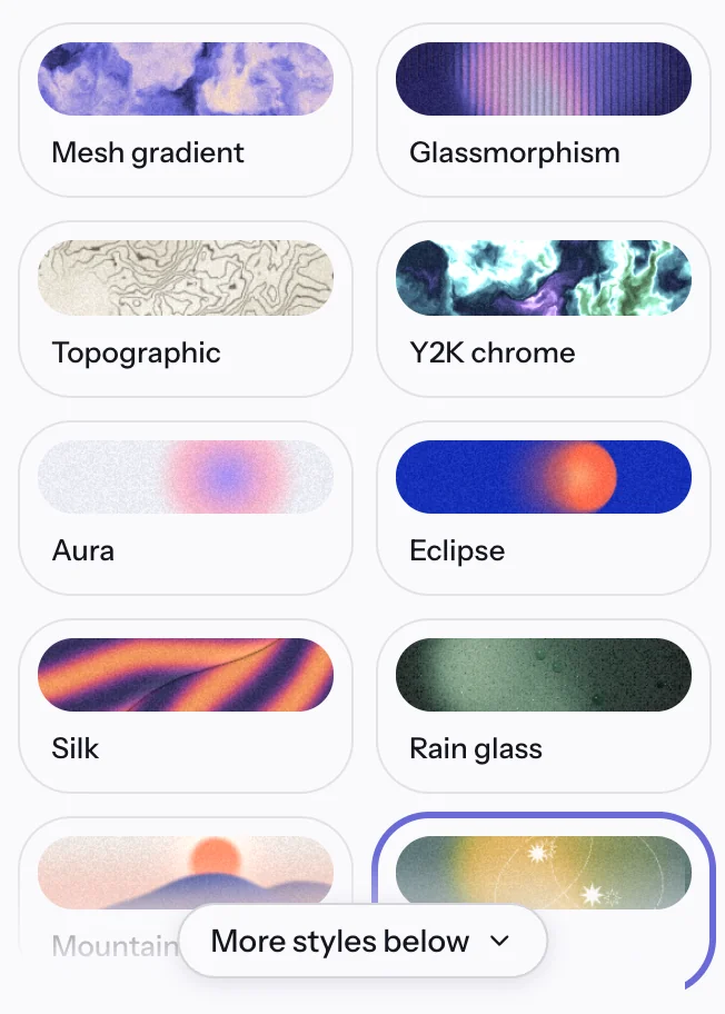
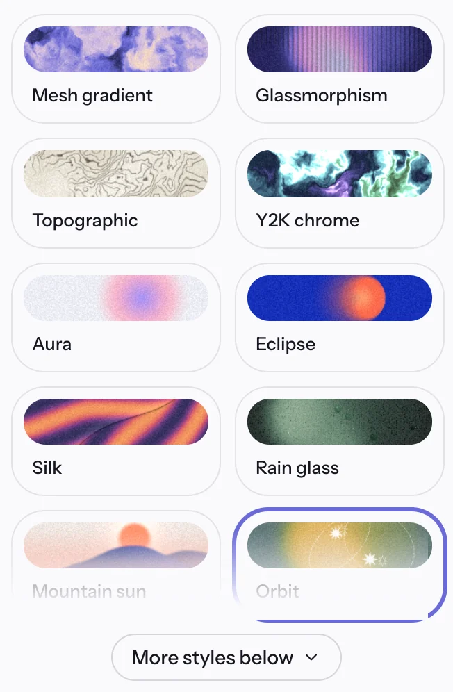
“More styles below” covers the name of a style.
This one started with me. I said a visitor wouldn't know the list scrolls, so Claude added a fade and a button. The audit then found the button sitting on “Mountain sun”, which read “Mountain” until you scrolled. One fix, and another check to catch what the fix did.
Keyboard users had to press Tab 59 times to get from the top of the page to the main button. A skip link now takes them there.
The panel built itself after the page appeared, and everything was pushed down. Its room is now reserved before it loads.
Adding a line is a top task, and it sat below colours and shapes. Text now comes right after Styles.
The page didn't say where your work was kept. The promise was true, but nobody could know it. Now it's one line under the styles.
I read the second report and accepted twelve of its thirteen findings. The one I turned down said the name in the header looks like a logo but isn't a link. An audit is advice, and the decision stays with the person who knows the product. Each fix went in as its own change, so any of them could be undone.
It doesn't make the specialist smaller. It removes the waiting.
The fourth check was people, and it found what the other three couldn't.
The audit had warned me itself: “An expert review finds likely problems; it doesn't measure how often real people hit them.” So far four people have tried it, and not only designers. None of us can be a stranger arriving on their own computer.
They don't understand why they are pushed down once they touch anything on the screen.
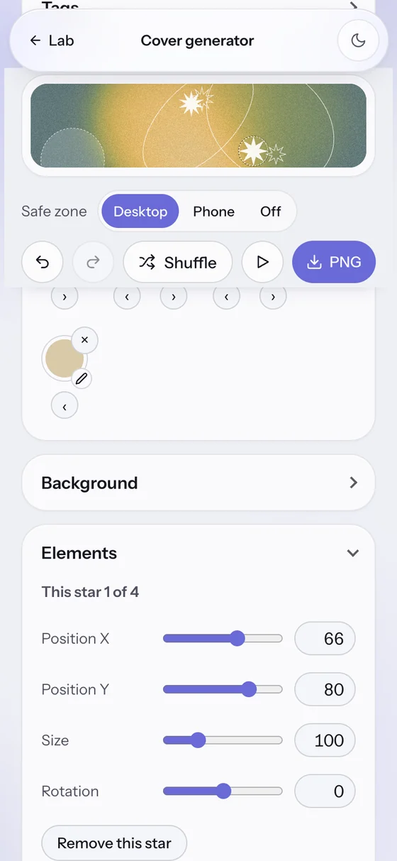
Touching an object was meant to bring its controls into view. In practice one tap threw the page about 1,800 pixels down. It had passed the tests, the scans, the audits and my own use. Now the page stays still, and a small button offers the controls.
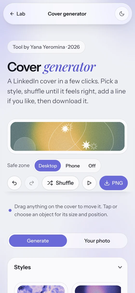
It's about freedom to do more with a photo and background.
Testers asked to zoom out of their landscape photos. Claude came back with three tidy layouts, and that line is me correcting it: they didn't want a layout, they wanted to play with their picture. Now the photo zooms and moves wherever you like, with a colour or a pattern behind it.
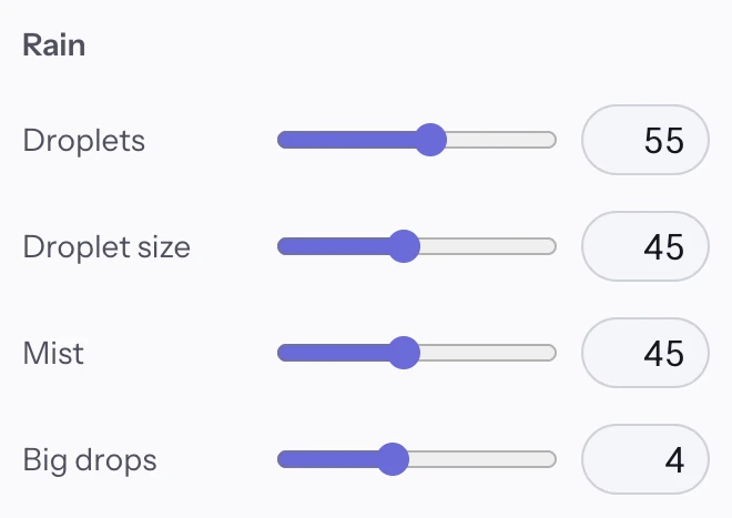
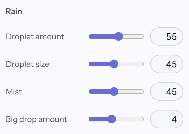
They don't understand what is it for.
That was “Off”, and then “Droplets”. No check can tell you a word means nothing to someone. “Off” is gone, and every how-many slider now says amount.
User see the button white, when it suppose to be purple.
Two testers saw this. I blamed the browser, because I use the same one. A setting that reduces transparency reproduced it exactly: a rule meant to help people had hidden the most important button on the page.


A background kept appearing behind the text, on 88 of the 222 covers we tested. The audit had suggested it, and Claude made it automatic. A tester noticed first. It's now a plain switch, off by default.
Things added in the generator followed people into the photo tab, with no way to remove them there. Each tab now keeps its own work.
Everything happens in your own browser.
There's no account and no upload. The cover is drawn on your device, and if you add a photo, it's kept only in your browser, so it's still there next time you open the page. The page says it in one line: “Saved in this browser. Nothing is uploaded.”
That wasn't a technical detail left for later. It was written down before the photo tab was built, as something that would make the feature a failure even if everything else worked.
You're the first user, so you'll know when it's wrong. A cover was small enough to finish and real enough to care about.
Say clearly what you see, in the language you already have. That is the part the AI can't do for you.
If you can't check the code, ask for tests, scans and audits, and read what they find.
Everything I could check had passed. Four people still found what I couldn't, and not all of them were designers.
The generator is a beta, and I'm still building it with Claude.
It makes LinkedIn covers today. Other sizes and other platforms are parked for later, so one design can travel without starting from zero.
Try it, make a cover, and tell me what's missing.
How this was put together: dates and counts come from the project's commit history (90 saved changes up to launch) and from my conversations with Claude, which is also where the quotes come from. The “before” pictures are screenshots of those old saved versions, except the photo one, which was remade to show the same framing. Testers' words are as they reached me.